
Have you ever built a website that looks perfect on Chrome but falls apart on Safari or Firefox? If you have, you already know how painful cross-browser problems can be. Cross-browser compatibility means your website works and looks the same across all major browsers.
People use different browsers on different devices daily and expect websites to function smoothly. If your site fails to do that, it creates frustration and can push visitors away. That is why it is essential to understand cross-browser compatibility and how to ensure your site passes the test. Let’s know what it means, why it matters, and how to get it right.
What Is Cross-Browser Compatibility?
Cross-browser compatibility means your website or web app works correctly on different browsers, such as Chrome, Firefox, Safari, and Edge. Each browser interprets code differently, so your site might look or behave oddly on some browsers without proper testing. For example, a button might be perfectly aligned in Chrome but misaligned in Safari.
Ensuring cross-browser compatibility is crucial because users access websites through various browsers and devices. If your site doesn’t function well on a user’s preferred browser, they might leave and not return. By testing and adjusting your site for different browsers, you provide a consistent experience for all visitors, which helps retain users and maintain your site’s credibility.
Why Is Cross-Browser Compatibility Important?
Every internet user is different. Some prefer Chrome, others stick to Safari or Firefox. Cross-browser compatibility is about giving all users a smooth experience, no matter which browser or device they choose.
1. You Don’t Want to Lose Visitors Just Because of Their Browser
Imagine building a great website but watching users leave because it doesn’t load correctly on their browser. This happens more often than you think. People use Chrome, Firefox, Safari, Edge, and many others. While Chrome leads the market, many users still depend on other browsers.
Now think about this. What if your buttons don’t work on Safari? Or do your images look broken on Edge? That’s a terrible first impression. If visitors face issues, they won’t switch browsers to view your site. They’ll simply move on to your competitor. Cross-browser compatibility ensures you don’t lose visitors because their browser differs from yours. You built your website for people, not for specific browsers. Make sure it works for everyone.
2. Better User Experience Keeps People Happy
You can have the most beautiful design, but it’s useless if people can’t interact with it smoothly. User experience is king. Websites should load fast, look clean, and work well. Visitors get frustrated when something feels broken or looks weird on specific browsers. They might not trust your website or your brand. Small things like a misaligned button or a non-working link can ruin the experience.
On the other hand, when everything works perfectly, no matter which browser someone uses, your site feels more professional and reliable. People like websites that just work. A smooth experience equals happy visitors.
3. Search Engines Love Sites That Work Well Everywhere
SEO isn’t just about keywords. User experience is a big part of ranking higher on Google. Search engines track how people interact with your website. If your site breaks on specific browsers, users might bounce quickly without interacting, which is a bad signal to search engines.
They think your site isn’t helpful. But if your website works fine across all browsers, people spend more time on it, explore more pages, and leave positive signals. Google picks that up and ranks you higher. A well-functioning, user-friendly site across all platforms boosts your SEO without much extra effort.
4. Your Brand Image Depends on It
Your website is your online face. It shows the world who you are and what you offer. If your site looks different or broken on some browsers, people might think you’re careless or unprofessional. It can hurt your reputation. You might lose trust even before you get a chance to pitch your service or product.
A strong brand should look and feel consistent everywhere. Whether someone visits from a mobile phone, tablet, or desktop using any browser, they should get the same clean experience. Cross-browser compatibility protects your brand’s professional image and builds trust with every visitor.
5. It Saves You From Costly Fixes Later
Fixing broken websites after launch costs both time and money. Imagine launching a site only to discover that many users can’t access it properly. You’ll spend more on developers to go back and fix everything. Worse, you might lose customers in the meantime.
By focusing on cross-browser compatibility from the start, you avoid these headaches. You catch issues early when they’re cheaper and easier to fix. It’s like checking a car before a long trip. Fixing problems early saves you from breakdowns later. Plan smart, save more.
6. More People Will Complete Actions You Care About
Every website has goals. These could include selling a product, getting newsletter signups, booking a service, or something else. If your site works perfectly on all browsers, visitors can smoothly complete these actions. But people give up if your form doesn’t load on Firefox or your checkout button breaks on Safari.
That means you lose sales or leads. A good user journey across all browsers helps you achieve better results. More completed actions mean better business performance. Smooth websites make visitors confident enough to interact with your services, boosting success.
7. You Stay Ahead of Competitors Who Don’t Bother
Let’s face it. Many businesses skip cross-browser testing because it’s not worth the effort. But that’s where you can win. Visitors will naturally prefer you if your site works perfectly across all browsers and your competitors’ sites don’t. People notice when a site just works without problems.
It builds trust and makes your brand stand out. Offering a flawless experience on all browsers shows you care about every user, not just the majority. Small details like this can make a big difference in a competitive world. It puts you one step ahead of those who overlook it.
Common Issues And How To Ensure Cross-Browser Compatibility?
Cross-browser issues are silent killers of user experience. They may seem small, but they can break your website on specific browsers. Let’s explore the most common ones and how you can fix them.
1. HTML/CSS Validation Errors
Building a website means writing HTML and CSS. But here’s the catch. Not all browsers handle coding mistakes the same way. If you forget to close a tag, use incorrect nesting, or write invalid CSS properties, some browsers might ignore it, while others will break the layout completely. You might not even notice it if you only check your site on one browser.
For example, Chrome might be forgiving and still render your page correctly. However, on Firefox or Safari, the page could fall apart. Many websites look fine on one browser but messy on others.
How To Solve It?
The easiest fix is to validate your code. You can use free tools like W3C Validator to scan your HTML and CSS. These tools will point out the exact mistakes in your code. Make it a habit to run these checks before launching your site. Always close your tags properly, follow HTML structure rules, and use valid CSS properties. This small step can save you from bigger display problems later. It keeps your site healthy across all browsers.
2. Vendor-Specific CSS Prefixes
Some CSS properties work perfectly in one browser but do nothing in others. This usually happens with newer or experimental CSS features like gradients, flexbox, or animations. Browsers like Chrome, Firefox, and Safari often use their vendor prefixes to handle these features. For example, -webkit- for Chrome or -moz- for Firefox. If you only write the standard CSS property without adding these prefixes, your design might break on specific browsers.
A typical example is CSS transitions or animations. They might work on Chrome but fail in Safari because you didn’t include the webkit prefix.
How To Solve It?
Use automatic CSS prefixing tools. Tools like Autoprefixer can add all the required vendor-specific prefixes for you. You simply write the standard CSS, and the tool takes care of the rest. This way, your website looks consistent across all browsers without you having to add every prefix manually. Many modern code editors and build tools already have Autoprefixer support built in. Use them to make sure you’re not missing any browser-specific styles.
3. DOCTYPE Declaration Errors
DOCTYPE might sound technical, but it’s one of the simplest things that can make or break your site’s layout. It tells the browser how to read and render your HTML. If you skip the DOCTYPE or use the wrong one, browsers might fall into what’s called Quirks Mode. This causes browsers to behave inconsistently, using old rules that can completely mess up your modern design.
You might see weird spacing, broken layouts, or font issues because you missed this tiny line at the top of your HTML.
How To Solve It?
Always start your HTML files with the correct DOCTYPE declaration. The best practice is to use this simple line at the very top of your HTML:
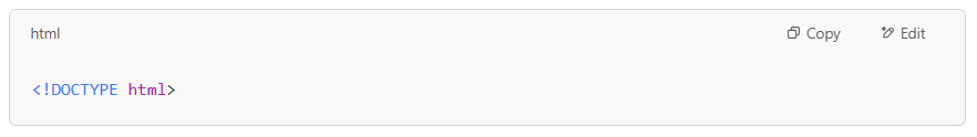
This tells all browsers to use Standards Mode, meaning they will follow the latest web standards. It ensures your site looks and works as expected across all browsers. Never leave it out, no matter how small your project is. It takes just one second to add, but saves you from hours of debugging layout problems later.
4. Outdated Browser Detection Scripts
Many websites try to detect what browser you are using. This is often done to load specific styles or features based on the browser. While it sounds like a smart move, it creates bigger problems if done poorly.
Some websites use old browser detection scripts that only recognize browsers like Internet Explorer or early versions of Firefox and Chrome. Modern browsers change fast; if your detection script is outdated, it might block newer browsers or fail to apply the correct settings. This leaves users stuck with broken layouts or missing features.
For example, a website might wrongly detect the latest Edge browser as Internet Explorer and load outdated styles, breaking the whole experience.
How To Solve It?
Stop relying on browser detection scripts. Modern web development best practice is to use feature detection instead. Tools like Modernizr check if the browser supports a particular feature, not which browser it is. This is a much more innovative and future-proof way to handle browser differences.
Instead of asking, “Is this Chrome or Firefox?” you should ask, “Does this browser support flexbox?”
This way, no matter how many new browsers come out, your site will check for the features it needs and adjust itself properly. Drop old detection scripts and move to feature detection for a cleaner, more reliable website.
5. Missing CSS Resets
Different browsers have default headings, lists, buttons, and margin styles. If you build a site without resetting these defaults, your website might look completely different on Chrome than on Safari or Firefox.
For example, a heading might have bigger margins in Firefox than Chrome, or a button might have different padding on Safari. These little style differences can build up and mess with your layout, spacing, and overall design consistency.
This is one of the most common reasons websites look misaligned or awkward on different browsers.
How To Solve It?
Use a CSS Reset or Normalize.css. These are pre-made stylesheets that remove or normalize the default browser styles. By applying them, you level the playing field, ensuring your design starts from the same baseline on all browsers.
One popular solution is Normalize.css, which doesn’t remove all styles but makes them consistent across browsers. You simply include it at the start of your CSS file, and it handles the rest.
Another option is to create a simple CSS reset by setting all margins and paddings to zero and defining a consistent box-sizing. For example:
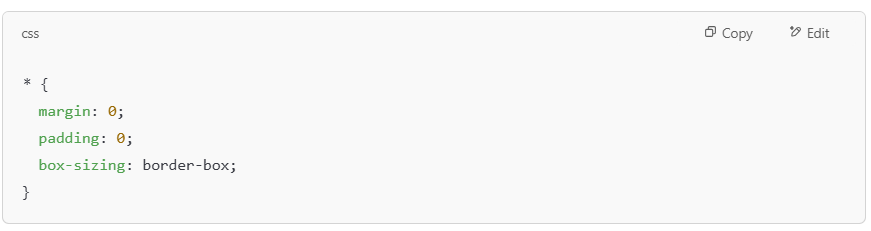
Starting with a reset gives you full control over your design and removes those annoying cross-browser style differences that ruin your site’s look.
6. Layout Compatibility Issues
One of the most frustrating problems you’ll face is when your layout looks perfect in one browser but completely breaks in another. You might see content overlapping, sections going off-screen, or elements stacking incorrectly. This happens because different browsers interpret CSS layouts differently, especially when you use newer techniques like Flexbox or CSS Grid.
For example, something that looks centered in Chrome might be pushed to the side in Safari. Or a multi-column layout might collapse into a single column in Firefox. These layout issues can ruin the user experience and make your website look unprofessional.
Sometimes, the problem is small, like a little extra space. Other times, it’s so bad that users can’t even navigate the page correctly. Either way, layout issues are a big deal you must catch and fix before your visitors do.
How To Solve It?
The solution is thorough testing and fallback planning. Always test your layouts on multiple browsers and devices, not just the one you use daily. Tools like BrowserStack or LambdaTest let you check your site on real browsers without installing them all.
Also, plan fallback styles for browsers that do not fully support Flexbox, Grid, or other advanced CSS features. For example, you can use simple float-based layouts as a backup for ancient browsers.
Finally, avoid using browser-specific hacks or shortcuts. Stick to clean, standards-based CSS and test often. This way, you can fix layout issues early before they ruin your users’ experience.
7. Browser-Specific Feature Support
Web technologies are evolving fast. New features like CSS Grid, WebP images, or advanced JavaScript functions are great, but not all browsers support them simultaneously. Some browsers fully support a new feature, while others may not or only partially support it.
For example, Safari might lag in supporting certain CSS or JavaScript features that work perfectly in Chrome. This creates situations where one group of users sees advanced effects or faster-loading images, while others see nothing or, worse, face broken functionality.
If you don’t check what features are supported by the browsers your users use, you risk breaking your site for many of them.
How To Solve It?
Use feature detection and progressive enhancement. With feature detection, you check if the browser supports a specific feature before applying it. Again, tools like Modernizr can help you do this easily.
Progressive enhancement means you build your website with basic functionality first, then add advanced features only if the browser supports them. This way, all users get a working website, and those on modern browsers get a little extra.
You can also check websites like Can I Use to see if a feature is fully supported across browsers before you decide to use it. Always have a fallback plan for older browsers so no user gets locked out.
Conclusion
Cross-browser compatibility is not something you can afford to ignore if you care about user experience. People visit websites using Chrome, Firefox, Safari, and Edge browsers. They expect the same smooth performance no matter what they use.
By ignoring this, you risk losing visitors and damaging your brand reputation. The good news is that with the proper planning, testing, and tools, you can avoid these problems. Make it a habit to check your site on multiple browsers before launching. Your visitors do not care about the technical details. They want a website that works for them every time.